Company
Government (NZ)
ROLE
UX/UI Designer
PLATFORM
Salesforce
duration
1 Year
KEY IMPACT
TL;DR
How Did the Work Unfold?
The work unfolded across three phases - portal redesign, reporting forms, and application redesign, sequencing around priorities rather than design convenience. Working within an already-decided platform meant every decision had to earn its place within what was technically feasible.

What Became Clear Across User Groups
Caregivers

Where it broke
Scattered and unclear information, often spread across external sites, made it difficult for caregivers to choose the correct application type.
Why it mattered
Wrong applications → resubmissions → delayed transport support→ Caregivers forced to reschedule schooling
Schools

Where it broke
School and caregiver portals looked identical, leading schools to submit applications without logging in and receive false success feedback.
Why it mattered
Applications appeared submitted but were never received → loss of trust → increased follow-up and manual checking
Transport Providers

Where it broke
A new reporting approach assumed higher technical literacy, creating reliance on training and support.
Why it mattered
Inaccurate data → delayed reporting → Manual intervention → increased operational load
School Transport Team
Where it broke
Headcount reductions combined with eight separate application form sets made the system difficult to maintain.
Why it mattered
Outdated information → slower assessments → delayed assistance → students unable to receive transport support on time
Key Quotes
Solutions
Here are a few of the design solutions as they related to the discovered core problems
Challenge No. 1:
How might we support caregivers and schools applying their applications simply and accurately?
Key design decisions:
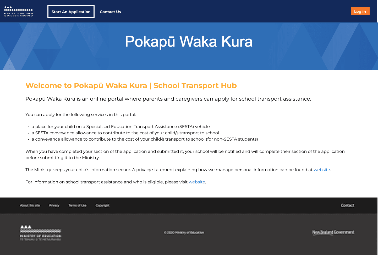
Before
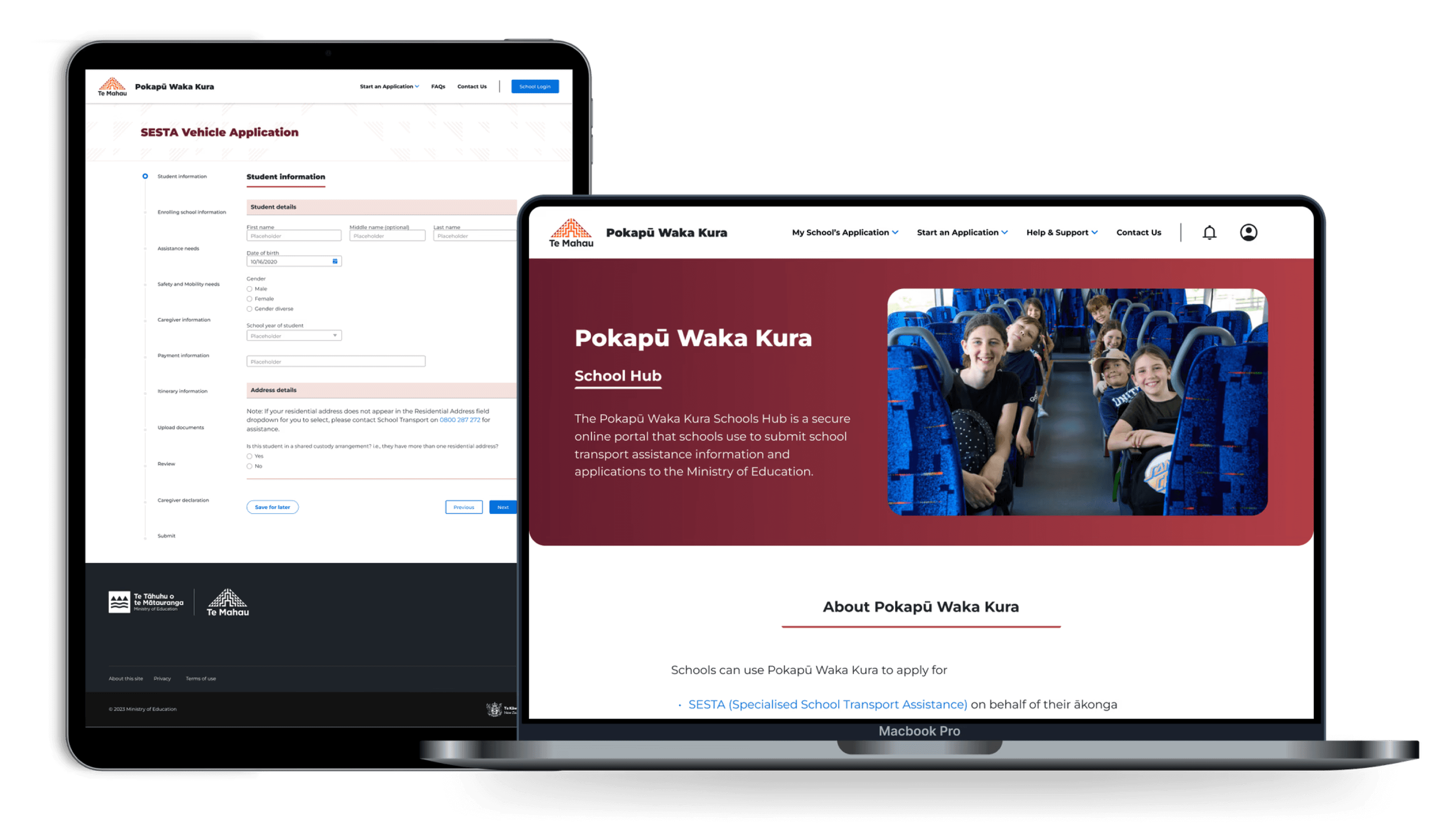
After - Caregiver Portal
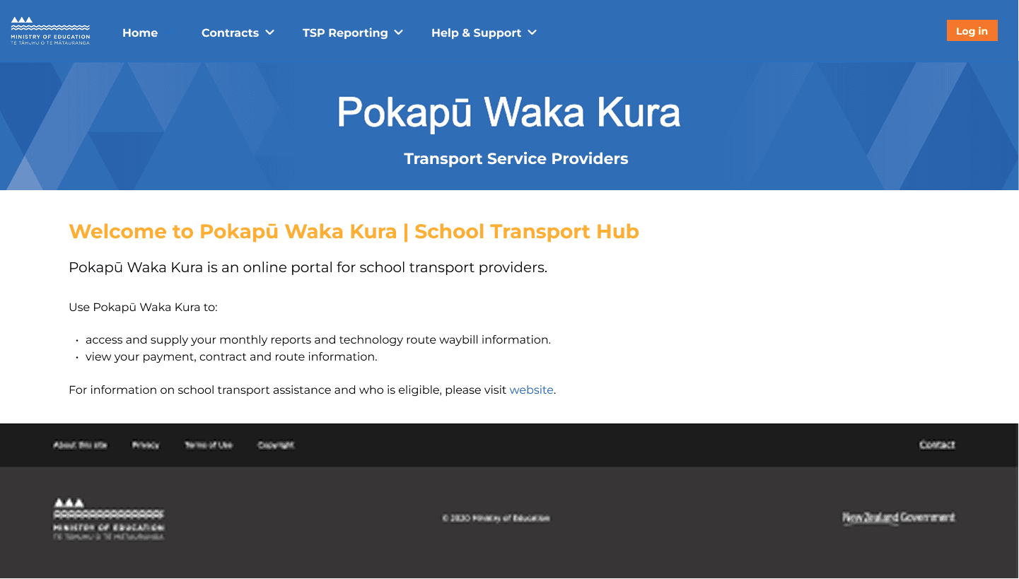
After - School Portal
Challenge No. 2:
How might we reduce work effort across the applications for both applicants and internal team?
Key design decisions:

Challenge No. 3:
How might we help transport providers complete each task confidently?
Key design decisions:
Challenge No. 4:
How might we make reporting process less tedious for schools and providers?
Key design decisions:
How I navigate constraints along the way
This project required balancing ideal UX against Salesforce platform limitations, tight timelines, and limited direct access to caregivers.
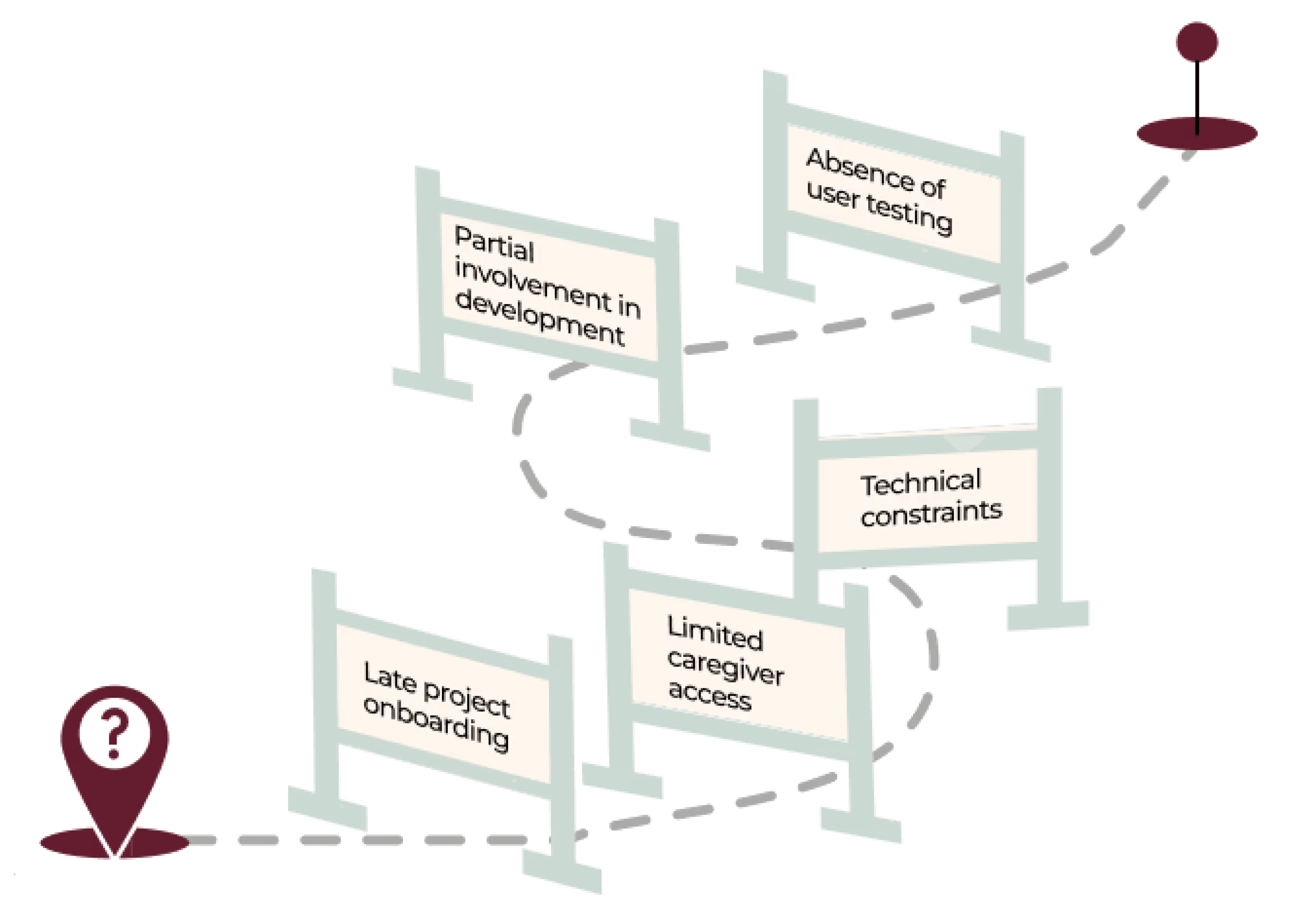
To move the work forward without increasing risk, I focused on a few deliberate strategies:
Bridged gaps in user insight by working closely with frontline staff who interacted directly with caregivers, ensuring decisions were grounded in real-world context.
Designed within platform constraints first, prioritizing native Salesforce components and introducing custom solutions only where they delivered clear value.
Partnered closely with developers, working side by side to align on feasibility early and maintain momentum within tight delivery windows.
Validated clarity through internal testing, using staff unfamiliar with the program to pressure-test navigation, language, and task understanding.
What This Project Taught Me and What Comes Next
I used to measure success by how well the design served users. This project deepened that - I learned to connect user needs to business outcomes explicitly, and frame design decisions in language stakeholders could act on. That's not a compromise, instead, it's how to make the user case land.